Ugly blogs
There's a lot of really good blogs out there that are just plain UGLY!
Making your blog more original in appearance is very easy, and I am willing to help. If you have a pretty good blog out there but you don't have a good looking Banner for the top, let me know and maybe I'll hook you up.
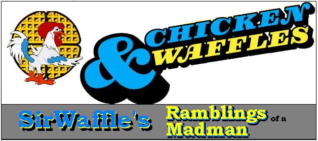
I did this beautiful piece for SirWaffles...
And maybe I can do something similar for you. TripJax has helped a lot of people, including me, with the look of their blog, so maybe I can give something back.
Email me if you're looking for some help.


7 comments:
Just let me know if you think mine falls into the ugly catagory. I had to do some work to get that banner at the top. the banner was thrown together by Lawdog (flagcityfun.blogspot.com) in about 15 minutes.
Great work here.
Your banner is cool, but you need to get rid of the Blogger bar at the top, in FireFox it covers part of your banner.
fatdan...to hide the navbar, add the following code to your template in between the style and /style tags...
#b-navbar { height:0px; visibility:hidden; display:none }
let me know if you have problems...
Wes,
Your blog is ugly on purpose. Tiffany Williamson? It makes the bile rise in my throat just seeing the picture.
But it works!
I need/want a banner but I'm an e-tard.
Drizz,
Email me and I'll send you a banner I made for you.
You know what would make this blog better? Abe Vigoda.
But John Malkovich is a close second.
Post a Comment