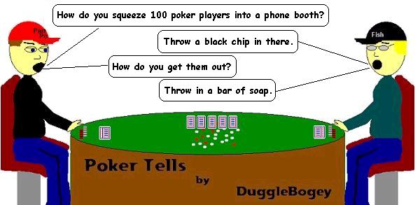
Poker Comic #43

Poker Comic Sponsored by Poker Source Online. Free Amazon Gift Certificates, just for playing online poker!
Formatting
Do you guys think I should keep the Poker Comic up all week by putting it above the blog title (like the "Donkeys Always Draw" graphic was for so long) or should I do what I have been doing and let it drop off the page after a day or so? I don't really want it to look like an advertisement, but since it is sponsored it might be the nice thing to do. Would it be too annoying to see the same comic for a whole week?


6 comments:
How about after it is trumped by a new post, you put it in your sidebar as a thumbnail picture that can be opened for viewing. It could go at the top right of your blog near your CopyScape info. That way people can easily see it and open it to view, but it will be the size of a thumbnail and not take up a bunch of space on your main page. Just a thought...
Best spot IMO would be right under your title description.
Right under the title as a weekly thing.
getting PSO swag for okie-vegas sounds like a cool idea. those guys are incredible at their customer service. that get nothing but props from me on my blog.
and i think drizz and act are probably more on the spot than i on where to put the comic...
Putting it wherever you want is fine, as long as it is posted as an actual post. If not, I'd never see it, as I read everything through Bloglines. If you just changed the image but didn't update a post, Bloglines would never know it changed.
Excellent point Alan, I hadn't thought of that.
If I do put it at the top for a whole week, I will do if AFTER putting it up as a post.
Thanks for all the input guys.
Post a Comment